Archive for the ‘Graphic Design’ Category
-
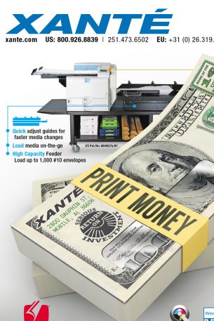
Xante: Magazine Advertising
A series of ads for Xante Corporation. Each is a two page spread.
-
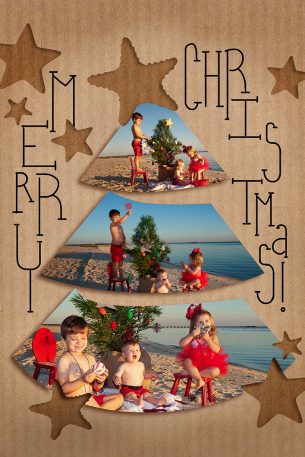
Barry Family Christmas Card
My wife is a genius photographer and her clients often want holiday cards, graduation invitation, thank yous, and other photo accessories. This is one example of custom holiday cards.
-
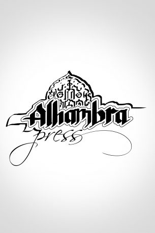
Alhambra Press
Logo design for a small publisher. It’s not the one they went with in the end, but I think it was my favorite.
-
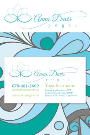
Anna Davis Yoga
Business card and logo design for a very talented yoga instructor from Atlanta. Calming, cool colors and delicate, flowing lines. And, if you’re paying attention, you noticed that the lotus flower shape makes the initials A and D. Congrats!
-
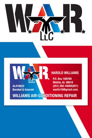
Williams Air-Conditioning Repair
Business card and logo design for a client who’s favorite football team is represented by an eagle and he’s former Coast Guard. So this one kind of sums him up as well as his business.
-
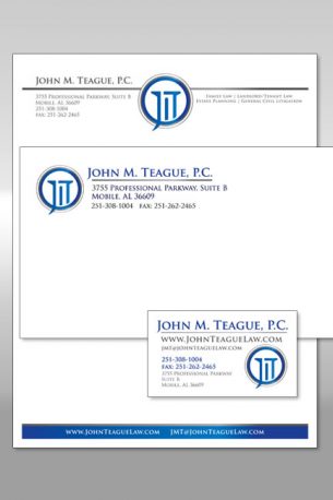
Teague: Stationery
This package is for a law office. Of course it had to give the impression of dependability and stability. What says that like the doric column? And the presence of such columns in courthouses make it a natural fit for the project.
-
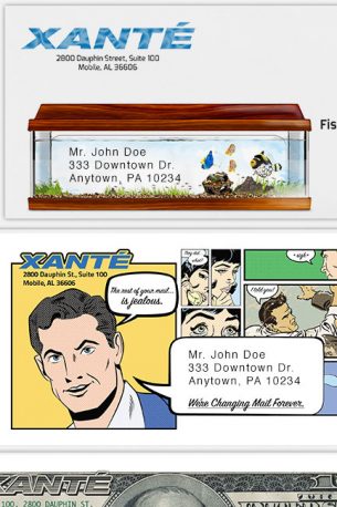
Xante: Promotional Mailers
These envelopes are part of a campaign that lasted over a year promoting Xante’s presence in the printing industry. These unusual pieces always generate phone calls for the company.
-
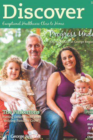
Discover Magazine – George Regional Health System
This project is one that required me to coordinate between the client, copy editors, and the printing and mailing house. I’m a one-stop shop.
-
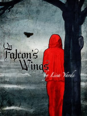
On Falcon’s Wings (Alt Cover)
This cover, though not ch0sen by the author, deserves its own space. Maybe it didn’t quite fit the tone of the story so she went with this instead. But this cover is so cold and bleak that I can’t help but love it. Does that say something about me? Did I just reveal too much?
-
Early Hospital Brochure
A gate fold brochure for a hospital. I love gate folds. Making the elements flow across the fold and then match to the inside is always fun to build.

