Archive for the ‘Illustration’ Category
-
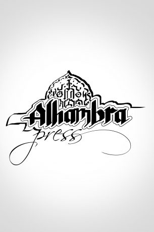
Alhambra Press
Logo design for a small publisher. It’s not the one they went with in the end, but I think it was my favorite.
-
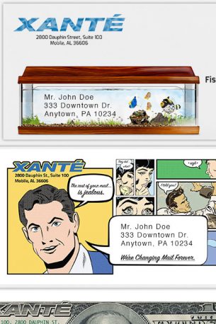
Xante: Promotional Mailers
These envelopes are part of a campaign that lasted over a year promoting Xante’s presence in the printing industry. These unusual pieces always generate phone calls for the company.
-
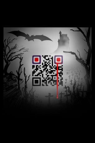
Custom QR Design: FreeLance Ganey Halloween
These were done for fun and promotion for my freelance business.
-
Artemis Rising: Glyphs
These are illustrations that appear throughout “Artemis Rising” by Cheri Lasota. Also shown here is the title design for the original cover of the book. The author wanted the drawings to look as if they’d been done on a beach with materials that could have been gathered in such an environment. The title design reflects the undulating motion of waved crashing in a storm.
-
Book Cover Design: Sultana
“Sultana” by Lisa Yarde. I enjoy title design very much and this is another one in which I focused a lot on it. I sampled lots of scripts relevant to the time period and and came up with something that felt just right for the story. The front covers of “Sultana” and “Sultana’s Legacy” were made by compositing 19th century Orientalist paintings. The front cover of the Omnibus is all me doing the illustration thing. Fabricating the textures, architectural elements, reflections, and leaves blowing in the wind on this one was really fun.
-
Book Cover Design: Artemis Rising
This is a variant cover for “Artemis Rising” by Cheri Lasota. We really wanted the moonstone pendant to feel powerful, as though it were filling up with moonlight. This effect is further magnified by placing it in a position where it takes the place of and eclipses the moon. Then, just so there’s no doubting its power, I set it on fire with that mystic, blue aura.
-
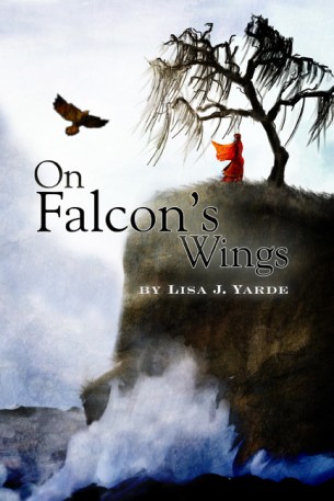
Book Cover Design: On Falcon’s Wings
This was a fun one. I got to paint everything you see here. And just as an internet bonus, here’s a version that I enjoyed, but didn’t make the final cut…
-
Custom QR Code Design: Dandelions
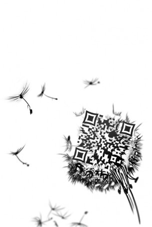
This QR code was designed to promote the release of the book, “Dandelions” by Jeremiah Telzrow from publisher Spirehouse Books. In the poster below, each of the smaller QR codes drifting off contain different taglines from the book. Also below are several different concepts pieces for supporting point of sale material.
-
Custom QR Code Design: A Monstrous Visage
This is a fun custom QR code I did for myself around Halloween. I did an entire series of them and it’s likely you’ve seen them (or are going to see them) elsewhere on this site. This one is a bit unorthodox because most smart phones have to be tilted slightly to the right in order for it to read. I wouldn’t do this for a client because of that (unless they reallywanted me to), but this one’s just for me.

