-
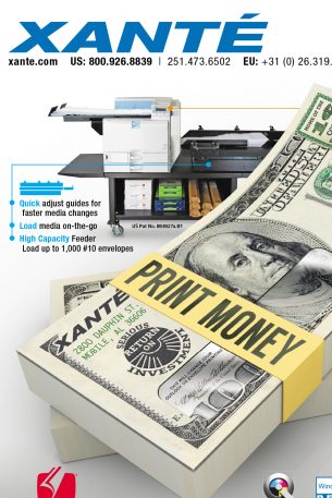
Xante: Magazine Advertising
A series of ads for Xante Corporation. Each is a two page spread.
-
Barry Family Christmas Card
My wife is a genius photographer and her clients often want holiday cards, graduation invitation, thank yous, and other photo accessories. This is one example of custom holiday cards.
-
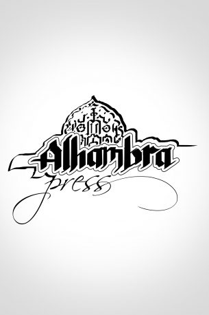
Alhambra Press
Logo design for a small publisher. It’s not the one they went with in the end, but I think it was my favorite.
-
Anna Davis Yoga
Business card and logo design for a very talented yoga instructor from Atlanta. Calming, cool colors and delicate, flowing lines. And, if you’re paying attention, you noticed that the lotus flower shape makes the initials A and D. Congrats!
-
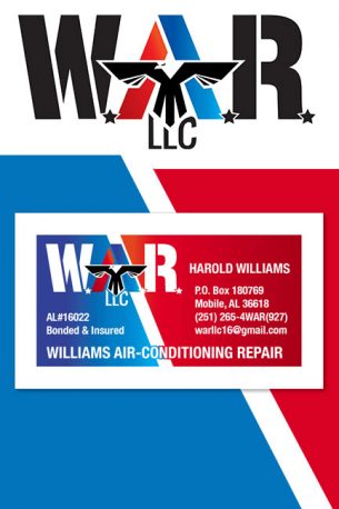
Williams Air-Conditioning Repair
Business card and logo design for a client who’s favorite football team is represented by an eagle and he’s former Coast Guard. So this one kind of sums him up as well as his business.
-
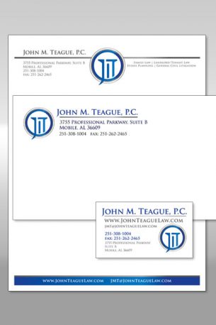
Teague: Stationery
This package is for a law office. Of course it had to give the impression of dependability and stability. What says that like the doric column? And the presence of such columns in courthouses make it a natural fit for the project.
-
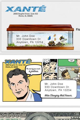
Xante: Promotional Mailers
These envelopes are part of a campaign that lasted over a year promoting Xante’s presence in the printing industry. These unusual pieces always generate phone calls for the company.
-
Discover Magazine – George Regional Health System
This project is one that required me to coordinate between the client, copy editors, and the printing and mailing house. I’m a one-stop shop.
-
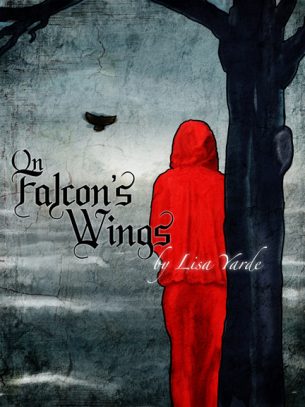
On Falcon’s Wings (Alt Cover)
This cover, though not ch0sen by the author, deserves its own space. Maybe it didn’t quite fit the tone of the story so she went with this instead. But this cover is so cold and bleak that I can’t help but love it. Does that say something about me? Did I just reveal too much?
-
Early Hospital Brochure
A gate fold brochure for a hospital. I love gate folds. Making the elements flow across the fold and then match to the inside is always fun to build.
-
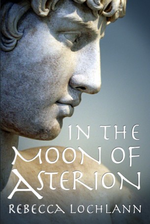
Book Cover Design: The Child of the Erinyes Trilogy
For this series, “The Child of the Erinyes”, the characters in the story have been represented by statues from antiquity. The cover photos were all taken from the public domain and I manipulated the lighting and color to add just the right amount of drama appropriate for each book. Book 1, The Year-God’s Daughter by Rebecca Lochlann. Book 2, The Thinara King by Rebecca Lochlann. Book 3, In the Moon of Asterion by Rebecca Lochlann.
-
Book Cover Design: Sultana
“Sultana” by Lisa Yarde. I enjoy title design very much and this is another one in which I focused a lot on it. I sampled lots of scripts relevant to the time period and and came up with something that felt just right for the story. The front covers of “Sultana” and “Sultana’s Legacy” were made by compositing 19th century Orientalist paintings. The front cover of the Omnibus is all me doing the illustration thing. Fabricating the textures, architectural elements, reflections, and leaves blowing in the wind on this one was really fun.
-
Book Cover Design: The Burning Candle
“The Burning Candle” by Lisa Yarde.
-
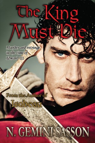
Book Cover Design: The King Must Die
The King Must Die by N. Gemini Sasson. I did quite a bit of photo manipulation on this cover. This guy’s cheek was covered in sand and I had to create a velvet texture to match his cape. We needed just a bit more room for Gemini’s name down there.
-
Email Offer Design
These images I made to be inserted into email promotions that mail 4 -5 times weekly. These are only a few examples of an ongoing project that started in 2007. As often as possible, I try to maintain a uniform look in each offer so that recipients feel a degree of familiarity and then every 4-6 months give them a fresh design. You will notice below that the latter offers have dropped the logo and header in order to simplify the feel. Beneath each of these graphics would be the fine print containing offer details and restrictions.
-
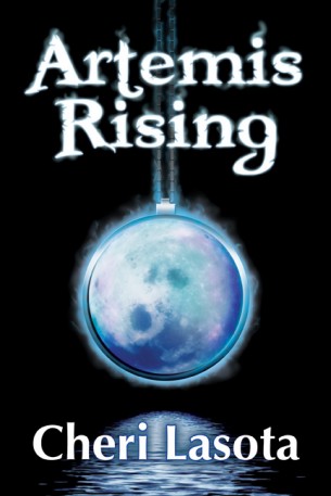
Book Cover Design: Artemis Rising
This is a variant cover for “Artemis Rising” by Cheri Lasota. We really wanted the moonstone pendant to feel powerful, as though it were filling up with moonlight. This effect is further magnified by placing it in a position where it takes the place of and eclipses the moon. Then, just so there’s no doubting its power, I set it on fire with that mystic, blue aura.
-
Book Cover Design: On Falcon’s Wings
This was a fun one. I got to paint everything you see here. And just as an internet bonus, here’s a version that I enjoyed, but didn’t make the final cut…
-
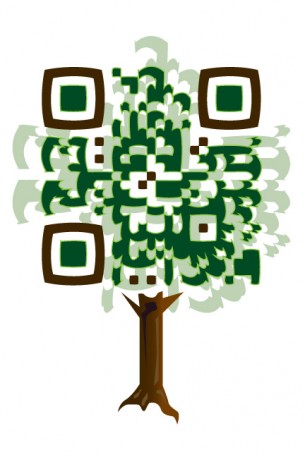
Custom QR Code Design: Deans’ Nursery, Inc.
This custom QR code was designed for a nursery to be used on price lists, letterhead, and print advertisements.
-
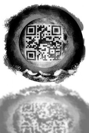
QR Code Design: Artemis Rising
Custom QR code design for Cheri Lasota’s novel “Artemis Rising”. Used on various advertising materials.
-
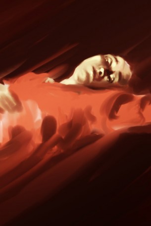
Assorted Illustrations
These are various digital sketches that I’ve done just for fun.
-
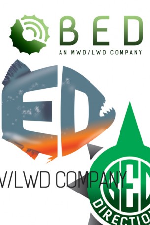
Logo Design: B.E.D. Directional
Logo Concepts for MWD/LWD directional drilling company. They sell the machinery that transmits information for mapping and directing drilling equipment, hence the drill bit with broadcasting lines. Also the owners requested a fish with sharp teeth, as they are all avid fishermen. The third design is, of course, based on a compass.
-
Logo Design: Sean Tigh Press
This logo was done for author Kristen Taber for her press logo. It’s a combination of two symbols which mean a lot to her personally, the celtic knot and the lotus blossom.

