Archive for the ‘Logo Design’ Category
-
Alhambra Press
Logo design for a small publisher. It’s not the one they went with in the end, but I think it was my favorite.
-
Anna Davis Yoga
Business card and logo design for a very talented yoga instructor from Atlanta. Calming, cool colors and delicate, flowing lines. And, if you’re paying attention, you noticed that the lotus flower shape makes the initials A and D. Congrats!
-
Williams Air-Conditioning Repair
Business card and logo design for a client who’s favorite football team is represented by an eagle and he’s former Coast Guard. So this one kind of sums him up as well as his business.
-
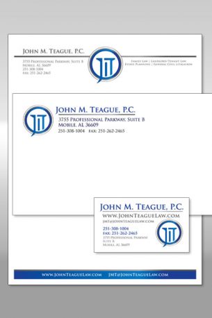
Teague: Stationery
This package is for a law office. Of course it had to give the impression of dependability and stability. What says that like the doric column? And the presence of such columns in courthouses make it a natural fit for the project.
-
Logo Design: Movella Portrait & Design
This logo was done for a wonderfully talented photographer (who, full disclosure, just happens to be my lovely wife) and harkens back to the glamorous days of 1950’s cinema. Back before we new how weird celebrities can be.
-
Logo Design: Green Keepers
Logo designs for a lawn maintenance company: Alternate:
-
Logo Design: B.E.D. Directional
Logo Concepts for MWD/LWD directional drilling company. They sell the machinery that transmits information for mapping and directing drilling equipment, hence the drill bit with broadcasting lines. Also the owners requested a fish with sharp teeth, as they are all avid fishermen. The third design is, of course, based on a compass.
-
Logo Design: Sean Tigh Press
This logo was done for author Kristen Taber for her press logo. It’s a combination of two symbols which mean a lot to her personally, the celtic knot and the lotus blossom.
-
Logo Design: Hall of Fans
Logo concept for an online memorabilia company.
-
Logo Design: Terpstra Woodworks
Logo concepts for a company that mills skis.


